
Part of my work at Verizon involves collaborating with business and product stakeholders to test a variety of design solutions. In this example, we were working to improve customer’s experience in a particularly difficult case — what happens when a customer’s credit results are so unfavorable that they would be required to pay the full retail price for the device their phone, rather than the monthly payment plan they were expecting?
Here’s what would happen in the original design:

That’s probably not the best experience. The customer has no way to opt out of the purchase aside from leaving the flow entirely, and we’re forcing them to click through an extra time to see how this affects their future bills. We knew we needed to update fix this, and luckily we were armed with the results of a recent test for a similar experience (when a customer has to make a downpayment).

We had learned from this test that that it helps to put a positive spin on the potentially bad news (that making a downpayment today would lower their monthly bill significantly) and to be transparent with all the information up front.
We had also learned via subsequent testing that offering customers additional options (such as purchasing a less expensive device, or bring their own device for free) yielded positive results. This second finding was somewhat controversial, as the business stake holders responsible for this specific part of the flow are understandably invested in the customer clicking through to check out from here, rather than veering off to look at other options. Nevertheless, we believed that this approach would be important when a customer is faced with paying the full retail price of an expensive phone.
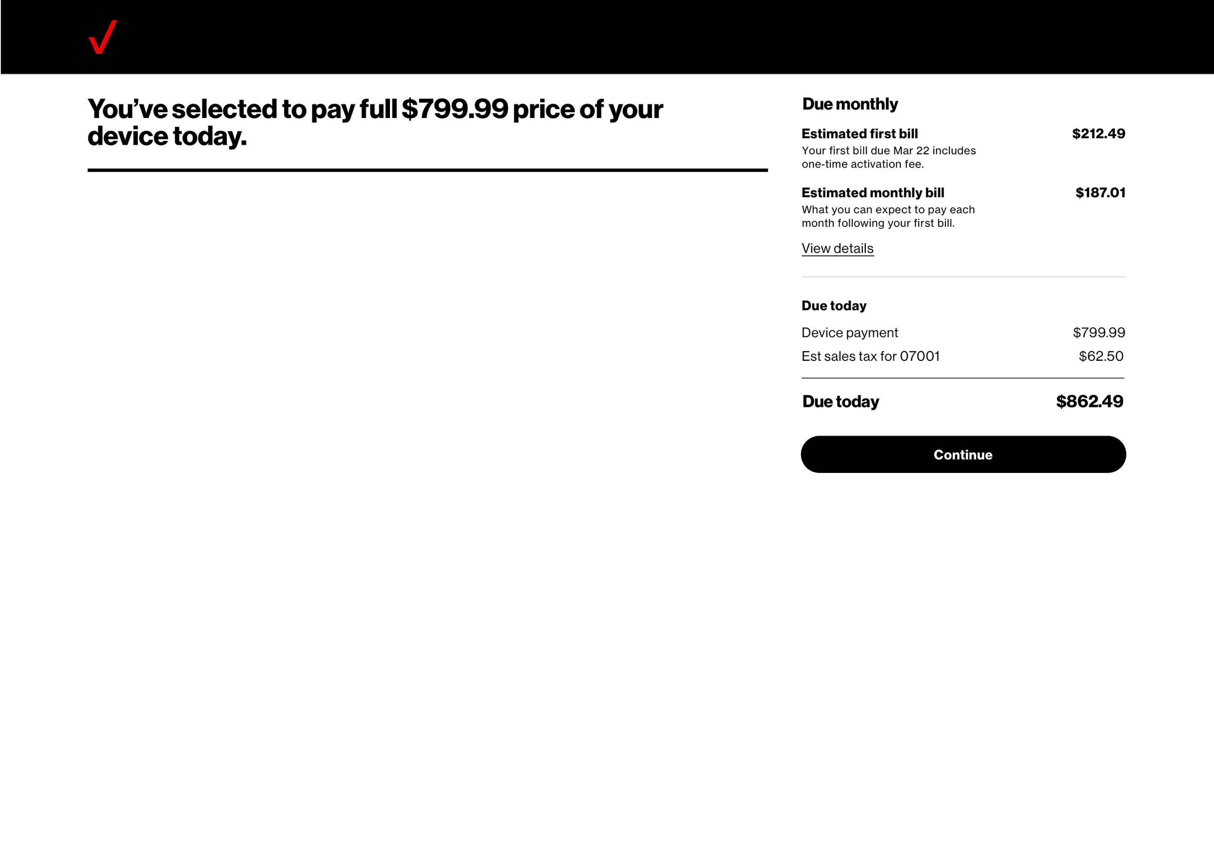
Extrapolating from the prior testing, we took the leap to update the screen in question during an overall redesign, knowing that we would test it soon. Here’s what it looked like when we were ready to start testing:

We knew that we wanted to find some ways to soften the messaging and we also wanted to play around with different ways of presenting the the customer’s alternative options. A lot of ideation took place, including design, content strategy, business, and product.

We felt like we were on the right track, but then … a dark pattern emerged (foreboding music cue here).
Because the primary business interest on this page is for the customer to continue without making any changes, a request was made to “hide” the other options:
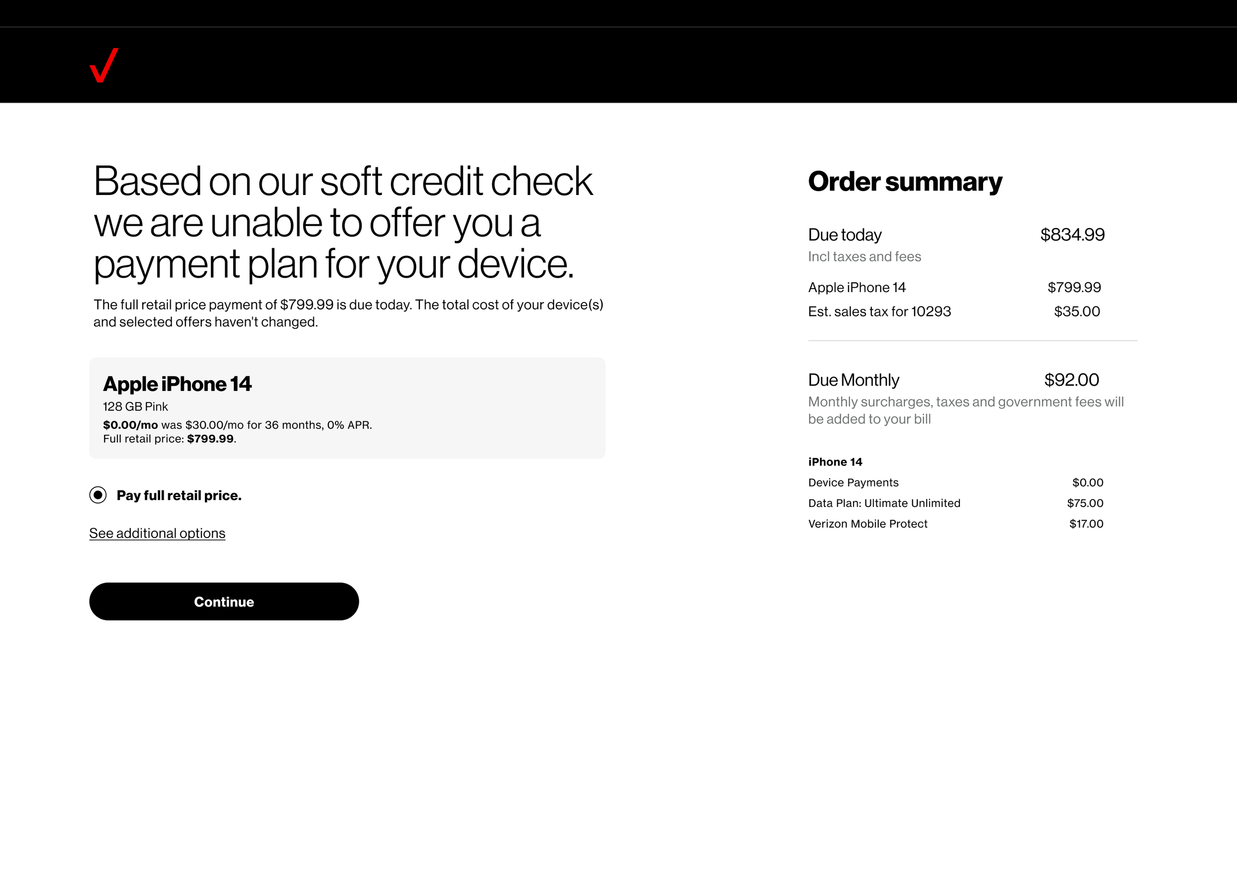

Needless to say, I was uncomfortable with this approach, but unfortunately the business and product stakeholders on the project were enthusiastic about it.
With the help of my design partners, as well as our leadership, we were able to explain that we could not move forward with this concept, not only because it went against our design guidelines and ethics, but because ultimately it was a bad idea from a business point of view.
The most important goal of this flow is a new Verizon customer — by trying to “trick” the customer into continuing without exploring their other options we would be more likely to lose them altogether.
Ultimately, we were able to carry our point, and continued to collaborate successfully to create some test concepts we could all be happy with.

We have not had the chance to run this test yet, but I look forward to the results.